Noa & Co
Background
Noa & Co began with hair stylist and influencer Chenoa Brookins’ dream of creating sustainable hairstyling capes. Her initial product is a game-changer, taking a humble staple in the salon world and transforming it into something inspiring, luxurious, and eco-conscious. Unlike traditional nylon cutting capes, Noa & Co’s hairstyling capes are made from recovered ocean plastic from fishing nets and other waste, and meet numerous environmental standards and certifications.
Chenoa painstakingly developed her product and had a clear mission in mind; however, she needed help creating her brand strategy and visual design. I was tapped at the inception of the brand to develop her idea into a defined strategy, including brand name and identity design, along with creating the key deliverables needed to launch - brand guidelines, business card, packaging, and initial website concept.
team
Ashley Austin, Creative Director,
Brand Strategy & Design
Chenoa Brookins, Founder
Deliverables
Brand Strategy
Brand Guidelines
Logo Design
Visual Identity
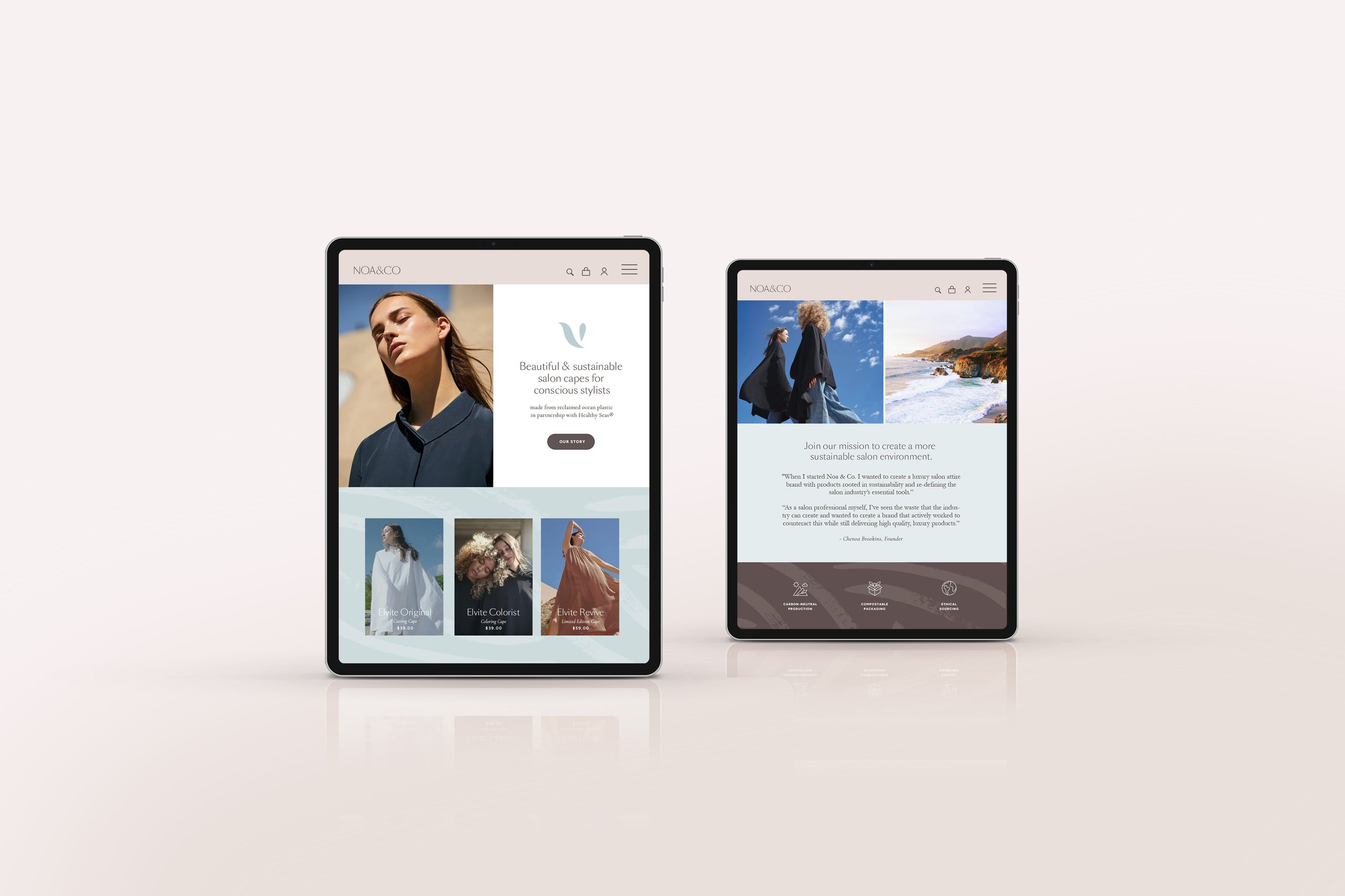
Website Design Concept
tools
Adobe Creative Suite


PHASE 1 | RESEARCH
Competitor & Market Research, Customer Profiles
In addition to brand investigation questions I provided to the founder, I conducted interviews with two stylists and one salon owner to get a sense of their needs and pain points, what brands they were currently using for salon supplies, and what brands they admired.
Direct and indirect competitor research proved that Chenoa’s idea was unique in the marketplace, and provided input on visual directions that would stand out.


An analysis of direct competitors showed an absence of eco-friendly capes in the market, and a clear opportunity to stand out with creative, aspirational product photography.
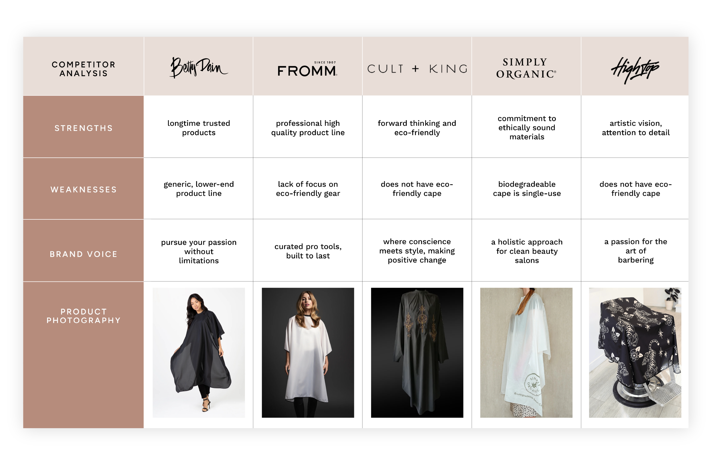
Competitive Analysis excerpt

Indirect Competitor Profiles
Salon Culture | Aveda | Cuyana
A visual survey of aspirational brands in the sustainable beauty space gave additional shape to the brand visual explorations.
The visual story began with a Brand Vision Board to aid in the design explorations. The product’s high environmental standards, combined with the relaxing vision of a high-end salon experience, were the inspiration for the nature elements, ocean shades and soothing textures that became the focal points of the board.

PHASE 2 | defining the brand
Brand Values & Naming
Keeping the research at hand as a guiding force, I worked closely with Chenoa to distill her brand values into a mission statement, through several variations, that felt right and summed up the company’s mission.
Naming the brand also went through multiple phases, starting with the identification of concept buckets (or areas of focus), followed by word generation, and finally editing and refining to the winning choice, a play on Chenoa’s childhood nickname, Noa. Other name development informed the current and future product lines.


Color Palette Explorations
Initial color explorations mined a series of woodland textures, coastal nature, and calming neutrals. The final palette incorporated coastal blues offset by grounding, warm nuetrals.


PHASE 3 | VISUAL DESIGN
Logo Design, Visual Identity and Website Mockup
In the third phase, I explored several different logo directions, initially in sketch format before refining digitally. Five refined concepts were presented to the client in the selected color palette. An abstracted white-winged dove, common to coastal areas from Baja California to the Caribbean, inspired the final selection, paired with a slim elegant typeface.


Final Logomark
Primary Logo

Horizontal Logo

Single-color Logo combinations

Brand guidelines
Once the logo was selected, I extended the visual design to include business card, collateral, and a bespoke pattern element inspired by ocean waves and hair textures. All of these elements ultimately became part of our Brand Guidelines document, part of which is shown below. These guidelines are an instructional manual for Noa & Co. to use going forward.

Outcome
Starting the creative process at the very inception of the brand is a magical opportunity for me as a designer and thinker. The deep dive into brand strategy stretched me in new ways and allowed me to better define the steps in my brand development & ideation process.
Brand design serves as a guidepost for years to come and is truly valuable foundational work for any new-to-market brand. The content shown here provided a strong base for Noa & Co. to launch their product into the world.
Within 1 year of launch, Noa & Co. has since created additional cape styles and continues to build their landmark brand, featured in Aveda salons and used by superstar stylist Jonathan Van Ness.
Previous case study
Designing an email campaign with users at the forefront
Next case study
Mamalou brand strategy