

Rexly Mobile App
Project Description
Juggling our pets’ everyday medication needs
Pet health is an increasing concern for owners. The growing focus on pet wellness represents an opportunity in the marketplace, and adds a layer of complexity for owners, vets and caretakers. How might we help pet owners and caretakers manage the day-to-day details of their pets’ prescribed medications?
Deliverables
User Research
Wireframing
Prototyping
Visual Design
User Testing
70% of pet owners purchased medications
for their pets in the last year.
objective
Design a Solution for Pet Medication Management
Rexly, a mobile app for busy pet owners, pet minders and vets, addresses pet owners' need for an all-in-one tool to managing their pets’ medications, with medication reminders, task sharing, messaging and dosage advice.
Helpful Onboarding
Upon opening the app, a brief onboarding flow outlines the app’s key benefits and prompts the user to begin a simple 3-step setup process.
Key Features
Home screen with
scheduled reminders
Once dosage reminders have been set up, these appear on the home screen and can be marked complete, or shared with household members.
OOPS this needs to have the home page icon showing on the bottom nav!!!!!!!
Pet Profiles
Individual pet profiles keep track of each pet’s medications and allows the pet owner to add notes on how to give doses.
Setting up medication
dose reminders
A bottom sheet accessed from the pet’s profile page allows users to easily set up reminders for medication. Before asking users to allow notifications, we remind them of the benefits they’ll get.
process
So, how did we get there?
Below, an overview of the research and design process:
User Research
User Surveys
20 pet owners participated in the user research, including primary caretakers, family members, one professional pet sitter and one veterinarian. Participants answered a 10-question survey about their pets’ medications, with a goal of identifying common challenges within the medication delivery space. I followed up with additional interview questions with four users whose pets had complex medication needs.
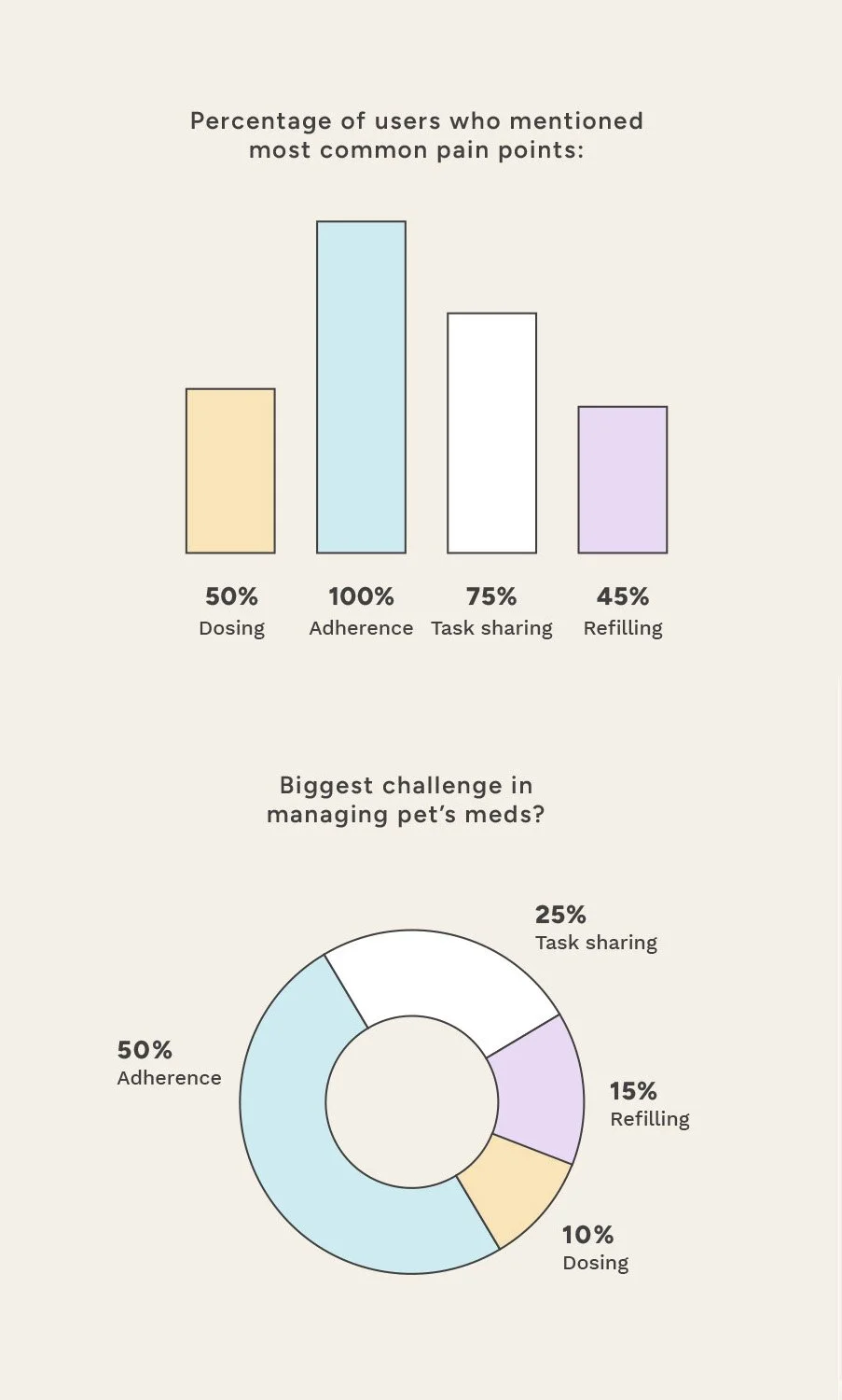
Affinity Mapping
Affinity mapping helped identify the key user pain points that arose with multiple users, summarized in the chart below:


User Personas
Survey data showed that pet owners with more than one pet, or a pet with a complex medical history, are likely to be juggling multiple medications and delivery methods.
Caretakers such as spouses and pet sitters are often involved the delivery of medication, while veterinarians are the key sources for prescriptions and dosage advice.
We ended up with four distinct User Profiles:
Pet Owner (Primary User)
Household member (Secondary User)
Pet sitters/walkers (Secondary User)
Veterinarians (Secondary User)
Analyzing the survey data
The primary issue for our users was Medication Adherence, mentioned in 100% of user surveys. Users also felt that Adherence was the single biggest challenge in managing their pets’ medications.
Task Sharing was a close second, highlighting the importance of being able to share medication information with household members and other caretakers.
Risk-Reward Analysis
Lastly, I conducted a Risk/Reward Analysis on the research. With many potential features our pet medication app could include, we needed to prioritize.
What features might be the most meaningful to our users?
Where should we focus our energies for the initial app offering?
Adherence stood out as the area with the lowest risk and highest reward, and we kept this as our north star throughout the design process.

Design Development
User Flows
User flow development was centered around user pain points. Helping the pet owner, our primary user, access Medication Reminders easily was the top-of-mind goal. Delaying Notifications and Account Creation allows the user to experience the benefits of the app immediately.


Wireframe Sketches
Initial quick sketches investigated how the medication scheduling and pet profiles might work, guiding users through the steps to set up medication reminders. This process helped to identify common UX design patterns for forms and to create a familiar and user-friendly experience.

Low-Fidelity Wireframes
Sketches were developed into initial wireframes exploring the home page, pet profile set-up flow, adding medications, and setting reminders.
I realized that adding medications could be complicated, and we could streamline data entry for the user by:
Allow for data input with minimal typing
Enable camera to scan prescription label
Predictive autocomplete for common medication names
Break onto multiple screens to avoid fatigue
Require only the info needed for set-up

Initial Prototyping
I created a simple flow encompassing onboarding screens and the pet profile setup flow, the initial step in creating medication reminders.
I wanted to test this initial flow and get a first impression from potential users.
This flow was tested with 3 users, who reacted positively to the design and found it simple and straightforward to create a pet profile.
Should this prototype be more stripped down, like less color and design elements? Or shown after visual design????
Visual Design
Creating a friendly, trustworthy brand image
Market research indicated that millennials are the leading users in the pet wellness category; the brand image brings in millennial appeal with a clean crisp design style; bright, airy photography; and friendly colors that evoke the fun playful moments we have with our pets.


testing
“Fun” and “Impressive design”, but not for Everyone
We tested our prototype features with 8 potential users. We explained that this was just a concept in development and asked them, upon seeing the initial features and getting a taste of how the app might work, if they would use the app.
Four users said they could see using the app themselves; two users said they would definitely recommend it to someone they knew; two users felt that their pets’ medical needs were simple enough that they would not use the app.
Additionally, our pet sitter user really wanted to see more of the sharing features and felt that this could be a highly useful tool for themselves and other pet sitters they know, to keep track of all their different clients’ needs.
Note on screens below: maybe just make this a bar at the bottom like on Chenoa’s AFTER learnings section


learnings
Creating a Delightful Experience from the Start
Given the high rate of drop-off for mobile apps in general, with 75% of users abandoning an app within one day of use, a cohesive and engaging onboarding process is a top priority for mobile design.
Adding Complexity
Further user testing would center around the medication reminder and sharing experience, to give users access to the app's best features. A progressive model of onboarding would be a reasonable approach, using design tools like tooltips, hotspots, and overlays, to educate users about the app's functions without creating overwhelm.
One takeaway from testing would be that it’s worthwhile to tackle the higher-risk endeavor of bringing the sharing features to life, by prompting users to add their family members to medication reminders and by advocating for pet sitter users with features that cater especially to their needs.